

The product I worked on is a large web platform for conducting, processing, and analyzing social surveys, as well as for internal communication within the company.
Before I joined, the product lacked a unified structure: components existed in isolation, logic varied from one section to another, interfaces evolved inconsistently, and development regularly ran into unpredictable constraints.
The product was built by a team, with part of the work done collaboratively. We discussed priorities, scenarios, and implementation constraints. At the same time, there were tasks fully assigned to me. I was responsible for shaping the product’s overall coherence: establishing the visual and component foundation, defining interaction rules, unifying interface behavior, and bringing all sections under a shared logic.
In practice, my area of responsibility covered the product’s design architecture, behavior, and visual system. I designed and redesigned the core modules of the platform: chat, calendar, tables, kanban, timeline, entity tree, and an interactive board. My role was focused on the quality, coherence, and long-term stability of the product.
Over time, the system began to resemble a spacecraft control panel — complex, layered, and built around a large number of interconnected scenarios. It evolved this way not out of a desire to make the interface “complex,” but as a result of constant compromises between visual logic, business needs, and the requirements of the product team.
As the product grew, maintaining consistency across such a complex system required a stable foundation. This later resulted in a design system that unified components, interactions, and visual rules across the platform.
As a result, the product transitioned to a shared logic. Interfaces became consistent, development more predictable, the system easier for the team to maintain, and complex user flows clearer and more navigable for users.
Chat
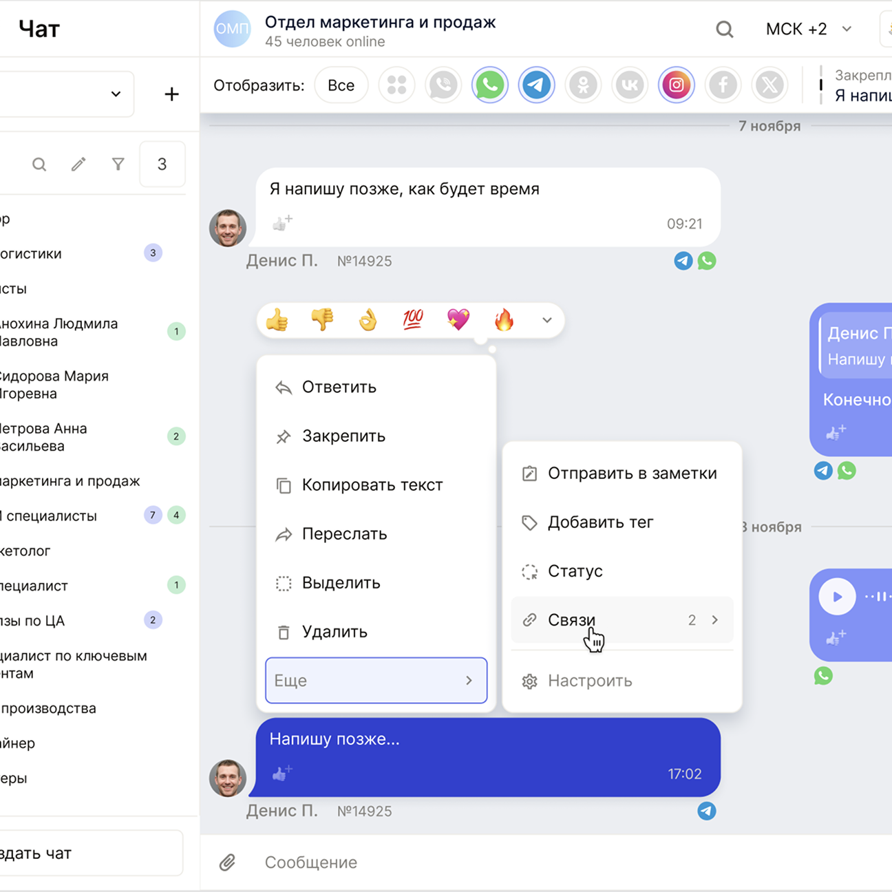
Chat became one of the deepest redesigns. Before the rewrite, it was a mash-up of different messengers where each part followed its own rules. I took a clear stance and set one principle: messages from Telegram, WhatsApp, VK, and other sources should read the same and differ only via subtle labels.
This module required constant decisions at the boundary between logic and UI. Chat is connected to almost everything: department trees, tasks, cards, tables, filters. When we discussed reactions, statuses, tags, or ID formats, I consistently chose a path where the interface stays simple on the surface and complexity moves inside the system.
The team adopted this approach, and it became the backbone of the module. Through iterations, chat turned into a stable tool: a unified feed with unique IDs, advanced filtering, keyword highlighting, reactions, tags, custom context menus, and a clean connection to the entity trees. Everything follows the design system and scales without pain.
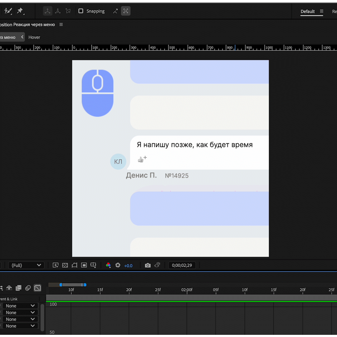
For key chat flows, I prototyped animations in After Effects.
They helped validate behavior, timing, and interaction rhythm — and served as a reference for implementation.
Calendar
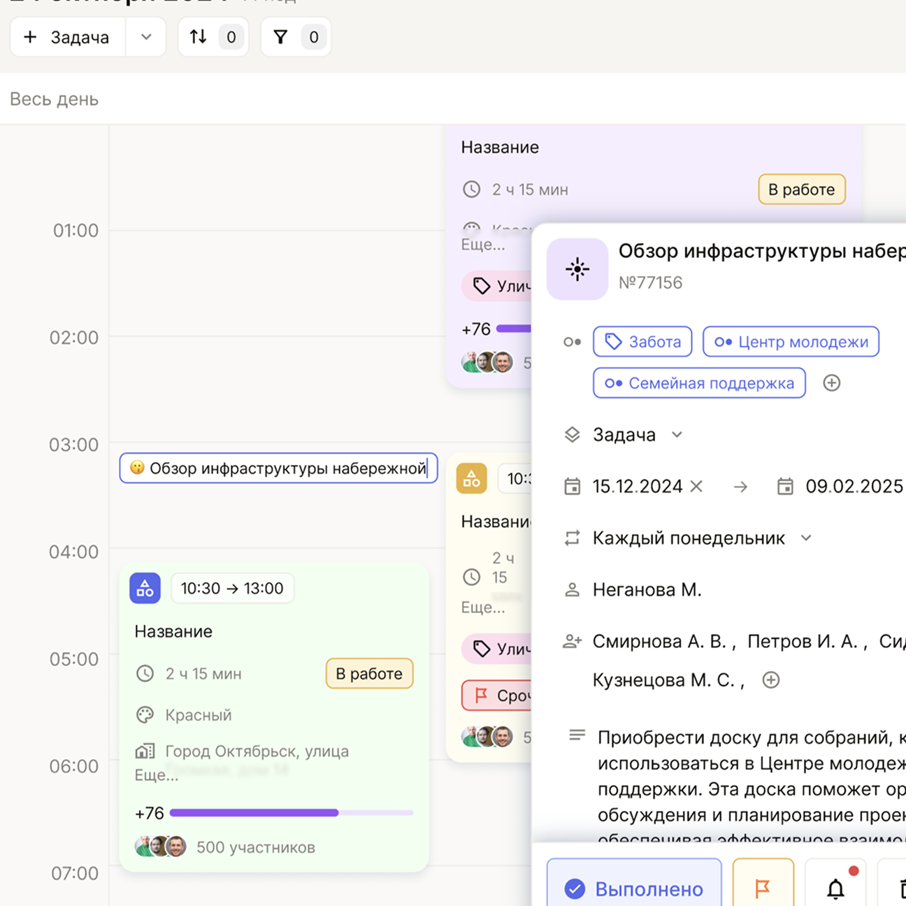
Calendar was the most overloaded module. It had to handle tasks, events, repeats, deadlines, notes, and dependencies. I defined how it should look and behave end-to-end: reworked the grid, entity card, legend, view modes, and the base interaction logic.
The hard part wasn’t visuals — it was aligning the modes. Day, week, month, and year views couldn’t fight each other. The product owner pushed for a broad feature set, engineering set architectural limits, users expected simplicity. At that point, I set a clear position: calendar must remain readable at any complexity level, and feature expansion must not break perception.
That decision became the turning point. You can create a task in seconds; the card expands into a full form with additional statuses, repeats, and tags. The color legend reduces cognitive load, and drag-and-drop works in every mode. The calendar supports layered logic and still stays clear — without feeling heavy.
Timeline
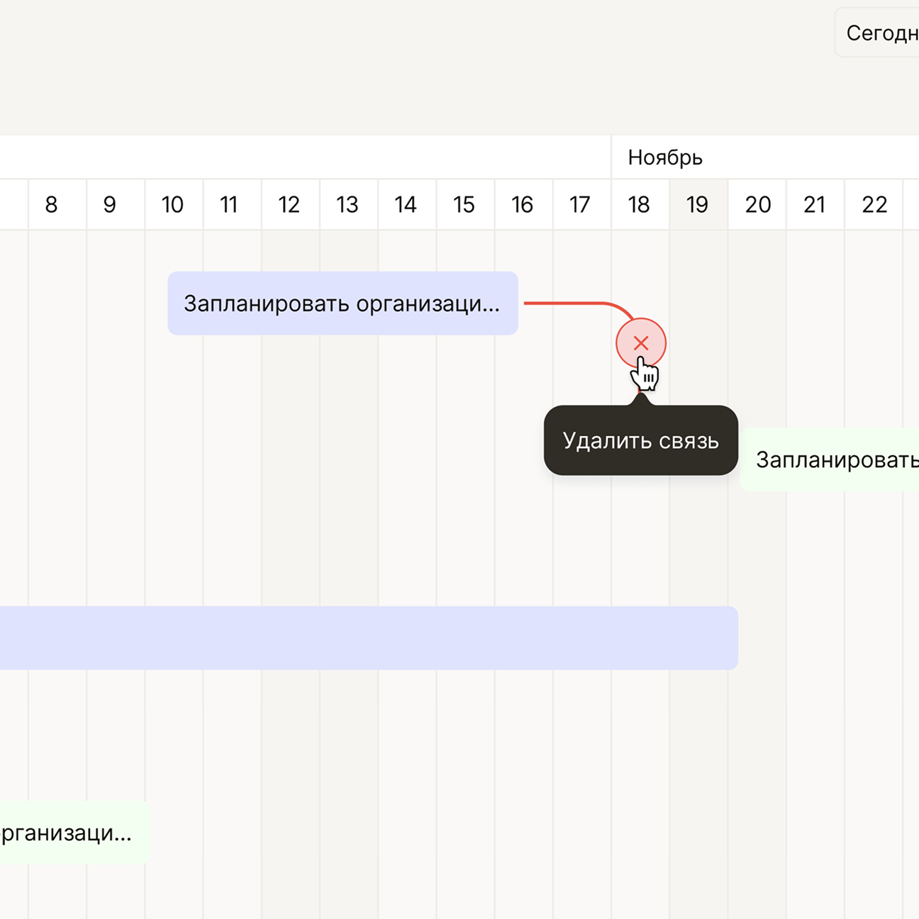
Timeline grew out of the calendar. It shows what the calendar can’t: dependencies between tasks — who blocks whom, what runs in parallel, where the process stalls.
Working on timeline wasn’t easy. The product owner wanted a flexible diagram, engineering had constraints, and users needed explanation — not a pro-level Gantt chart. We spent time finding the balance between power and clarity.
In the end, timeline got a flexible scale, tasks with different durations, an extensible grid, neat connections, and the ability to drag items and resize their duration. It reads cleanly and leaves the feeling that the schedule is something you can actually understand.
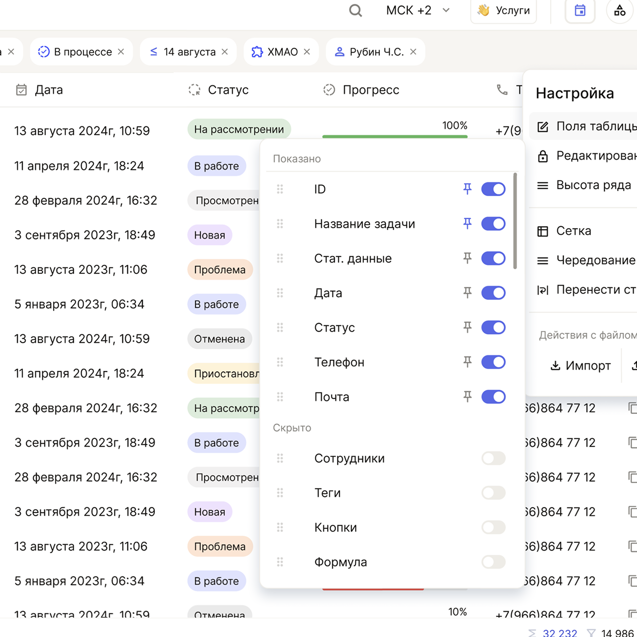
Tables
Tables looked simple — right up until we started working with real data. They became one of the core tools: survey analysis, filtering, stats comparison, and large value sets.
I built four display modes — no lines, with lines, zebra, zebra with lines — plus three row densities. The goal was to make tables work equally well in “light” scenarios and in heavy ones.
Complexity came from behavior: column rendering, search, filters, bulk actions, user-defined “operations” (for example, mass value replacement), export. A separate chapter was the color marking of cells and columns demanded by the product owner. We debated for a long time how to implement it without killing readability — and landed on an approach that delivers the needed signal without visual overload.
Now tables look clean and handle the load they were built for.
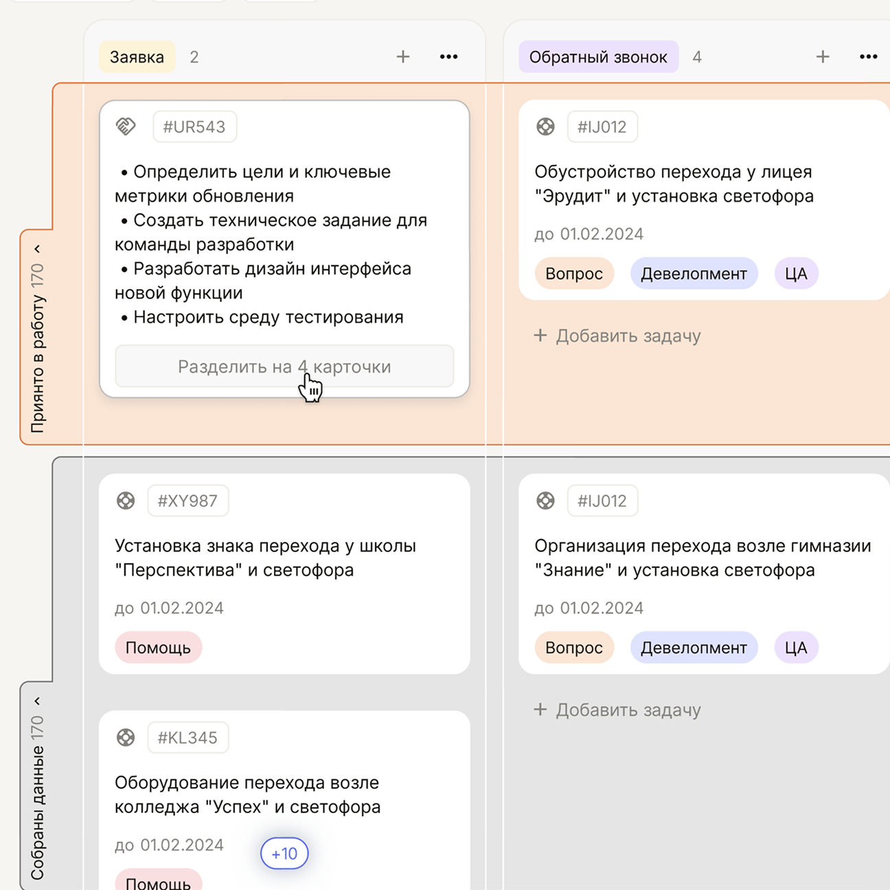
Kanban
Kanban had to be understandable in the first second. Minimum effort — maximum clarity. I built it around a simple structure: statuses, columns, cards. At the same time, cards contain a lot of information, and it had to stay readable without losing meaning.
One special challenge was multiple boards on one screen. The product owner wanted users to switch between different processes easily. We implemented collapsing and expanding boards, so you can work in parallel without losing context.
Task grouping was also debated heavily. There were many options, but we chose the one that preserves visual order while still giving control.
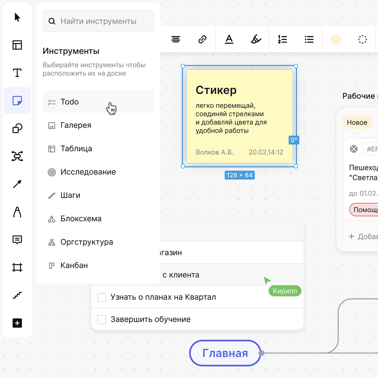
Interactive board
The interactive board is the opposite of strict modules. It’s a place for ideas, diagrams, relationships, text, sticky notes, and small remarks — somewhere between Miro and an internal workspace.
The challenge here was different: not letting elements drift into different styles. I kept it minimal so even a dense board wouldn’t turn into visual noise. Cards, connections, and text blocks all speak the same system language.
We designed connections so they’re readable instantly: soft lines, lightweight markers, no visual jumps.
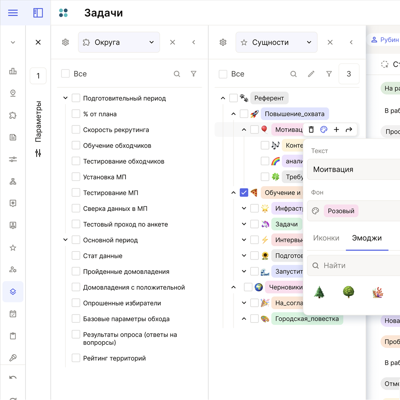
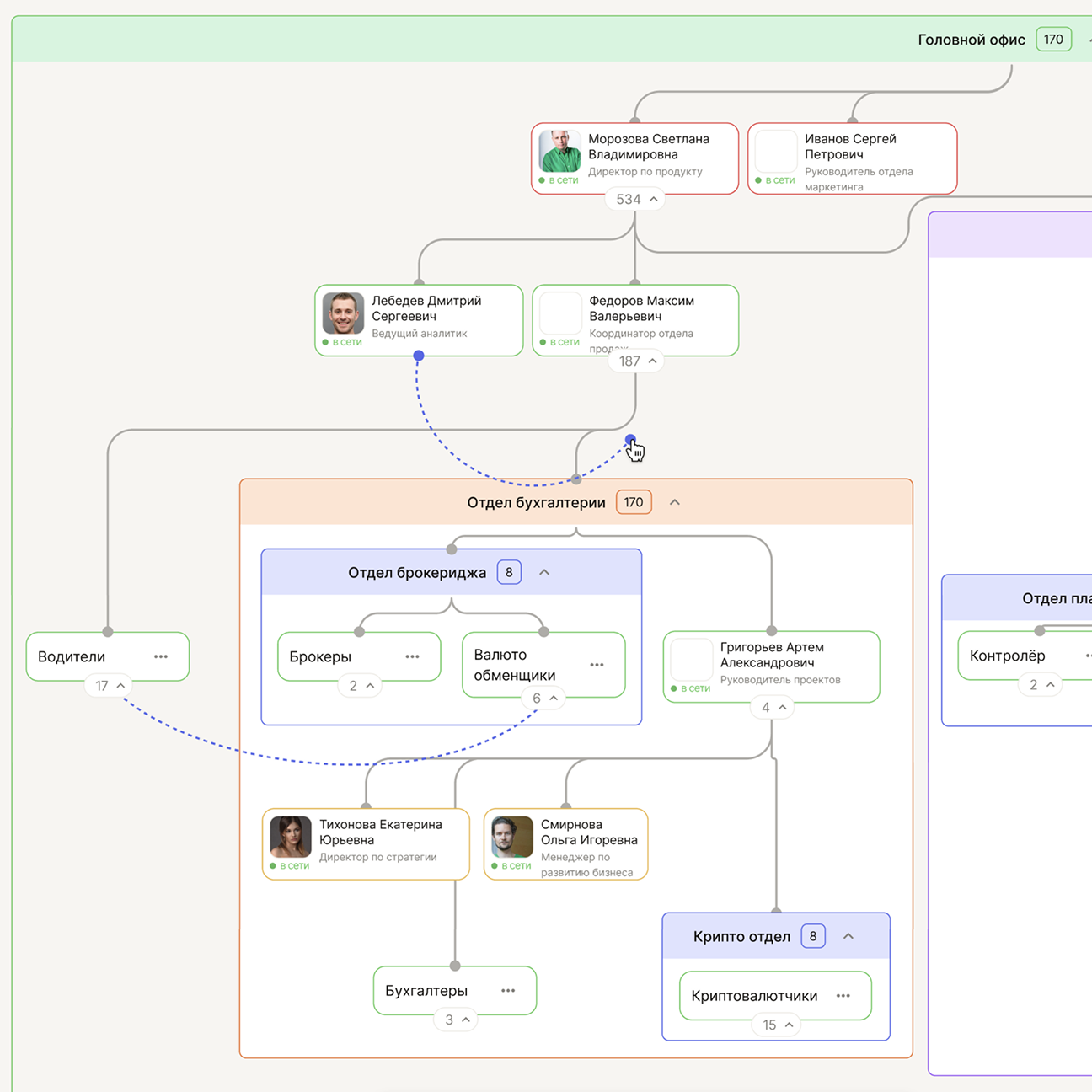
Entity tree
The tree is the quiet heart of the entire system. It ties together chat, tasks, tables, statuses, tags, and the department structure. Without it, the product would fall apart instantly.
I reorganized the tree so it feels simple on the outside while staying strong inside. Every nesting level must read instantly. Every indent matters. Every node movement must be predictable.
Most importantly, the tree is used everywhere. One wrong visual code would break the whole product. That’s why we made it as concise and systematic as possible.
Org structures
This module came from a direct product requirement: we needed to see people, roles, reporting lines, and contribution in one space — and lay the groundwork for scoring and evaluation. A simple tree wasn’t enough.
I avoided a rigid corporate chart and built a free canvas instead. The structure reads through rhythm, spacing, and emphasis, scales from dozens of nodes to thousands, and still remains clear.
Color works as navigation across roles and cohorts and can be tuned per scenario. Interactions are baked into the logic: links, level restructuring, and dependency views work without training.
As a result, the module became a working framework for org structures and made complex hierarchies much easier to navigate.
Visual foundation
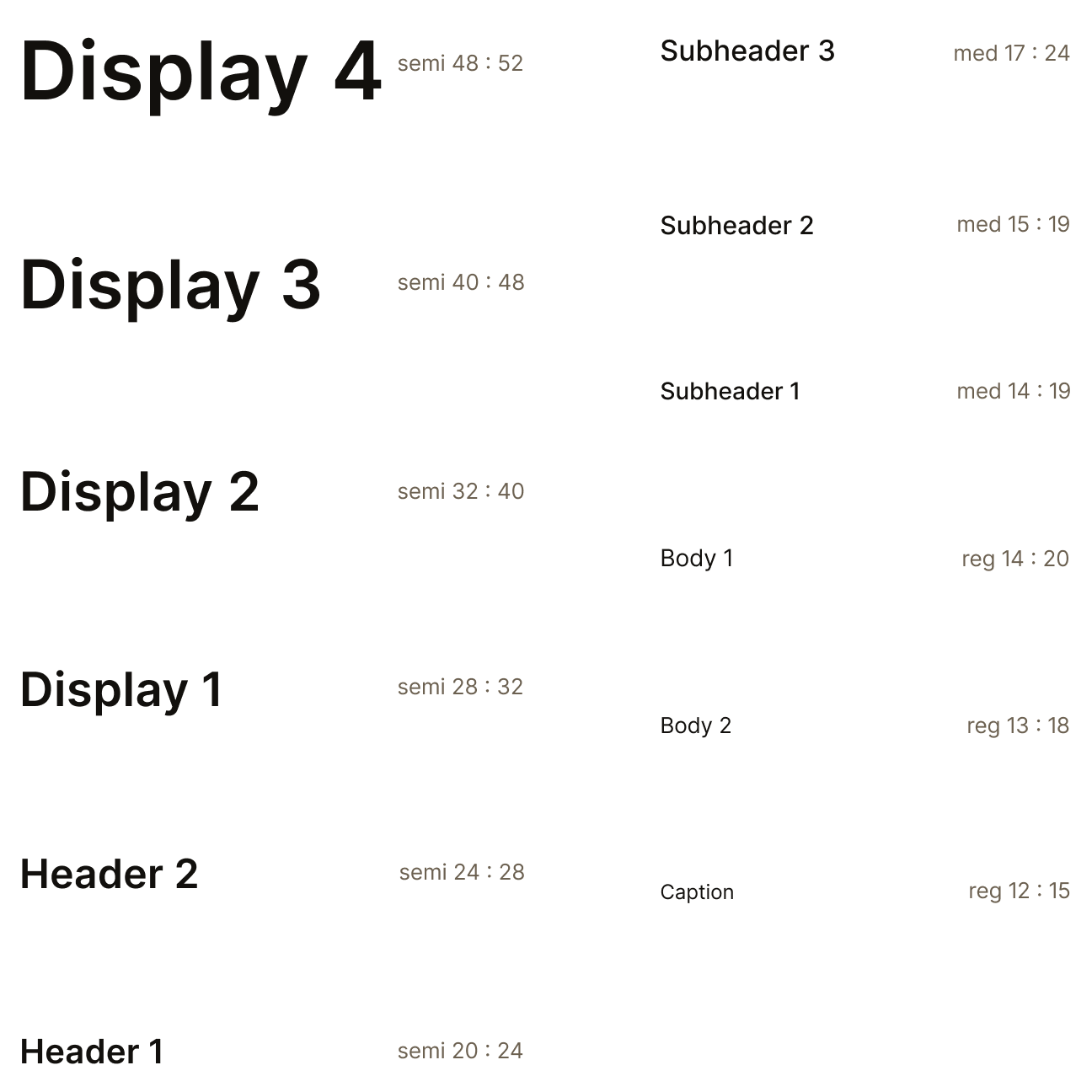
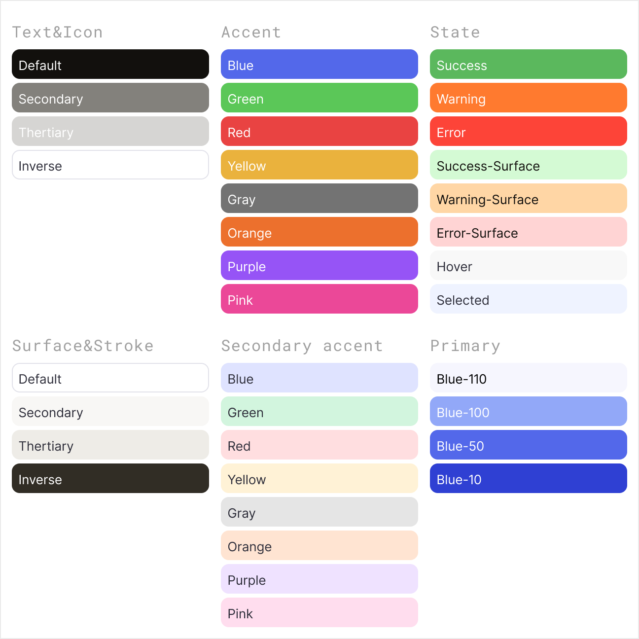
I defined three core sets: color, typography, and icons.
For type, we chose Inter Tight — it’s strict and tech-forward. During discussion, I adjusted tracking and proportions to make it feel more airy without losing precision.
The color palette was designed for two modes: light and dark. Switching happens instantly through a plugin, and the entire interface stays consistent.
The palette is applied across every core flow: chat, tables, calendar, and kanban.
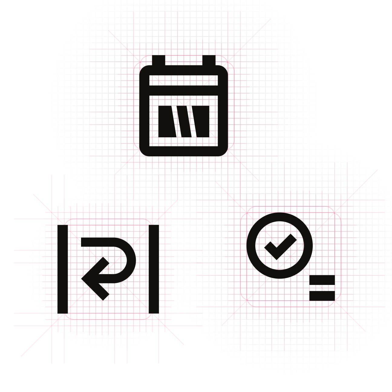
Icons were based on Material Design, but many were redrawn to match a single style, grid, and optical weight.
Design system
When I joined, the interfaces weren’t connected: different type, different colors, components behaved differently. Any change triggered a chain of issues. To move forward, we needed a foundation first. I built a design system roadmap and reworked the base from scratch for every scenario.
More than once, there were proposals to “expand” the system with decorative tricks or visual exceptions. I intentionally pushed back. With the current data density and the number of flows, those decisions would have destroyed coherence and readability. Instead, we scaled through states and context — not by inventing new shapes.
.png)
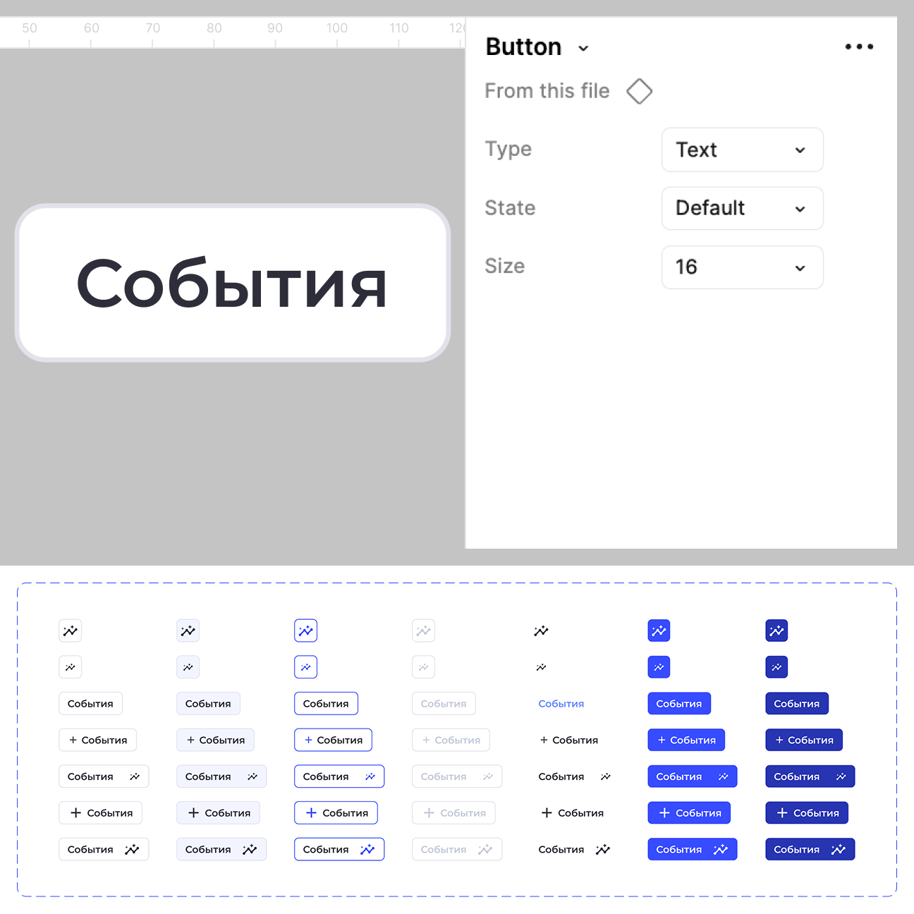
From the base components, I defined behavior principles that stay the same across the whole product.
Buttons, checkboxes, radio buttons, selects, inputs, toggles, sliders, progress bars, and pagination — everything was aligned by size, spacing, and states.
.png)
.png)
.png)
This is where the smaller mechanics connect.
Dropdowns, tabs, filters, toolbars, lists, headers, date pickers — everything is built on the same patterns to preserve the system’s overall character.
.png)
.png)
.png)
These components already carry full functionality: cards, left navigation, entity tree, tables, chat, calendar, timeline, kanban, and an interactive board.
They combine atoms and molecules into self-contained systems.
.png)
.png)
.png)
Once the design system existed, the team stopped re-litigating basic decisions on every new screen. Focus shifted from “how it looks” to “why it exists.” That reduced late-stage revisions and simplified communication between design and engineering.
New modules stopped breaking adjacent parts of the product. Even with complex logic, they plugged into the existing system without rebuilding the UI or losing integrity.
Takeaways
This project marked my transition from designing individual screens to treating the product as a system. I quickly realized that any local decision inevitably affects the overall structure, interface behavior, and future scalability.
My process worked from the general to the specific: I defined key entities, relationships, and scenarios first, and only then moved on to user paths. The main challenge was finding the right balance between business requirements, engineering constraints, and the need to maintain logical consistency.
Thinking ahead became my key principle. I consciously prioritized resilience and scalability, choosing long-term system stability over quick visual fixes that could lead to dead ends later on.
As a result, the project evolved from a set of disjointed mockups into a system with unified logic and clear growth rules. I stopped thinking just in “interfaces” and started thinking in structure and behavior. I believe this systemic approach is essential when working on any complex product.
